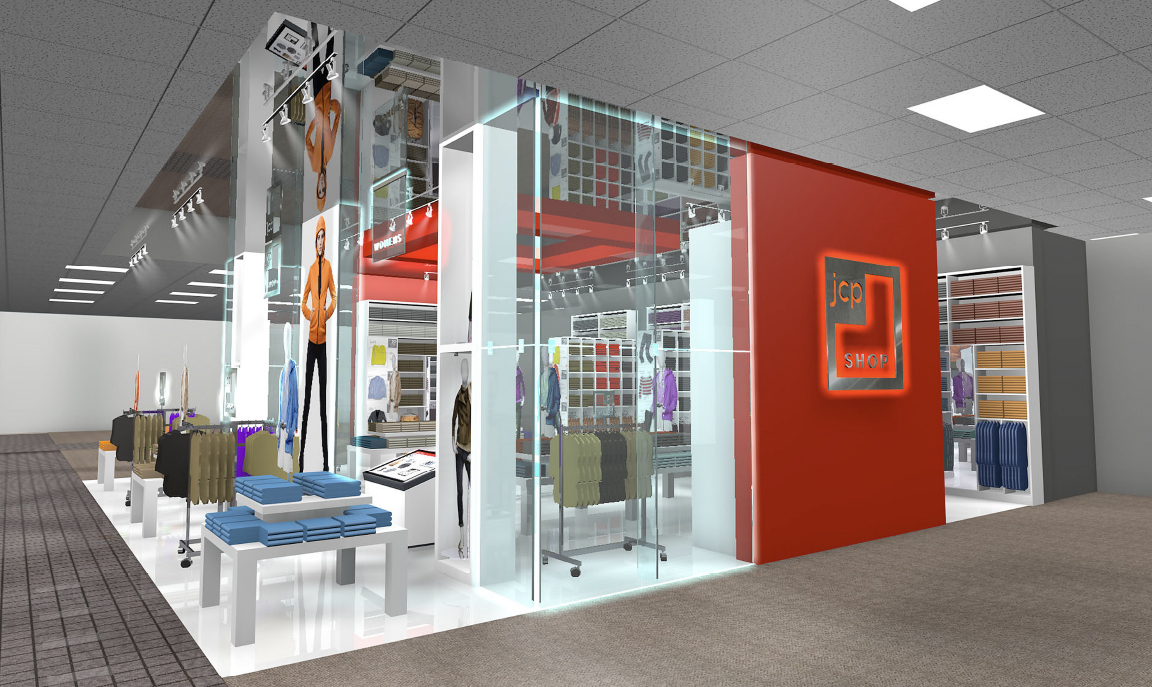
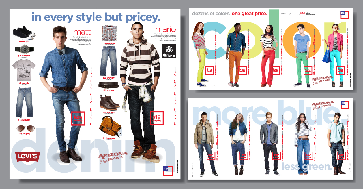
JCPenney went through an upheaval a few years ago and one of the changes was recreating their logo into the Fair and Square icon. The new logo represented the American flag. As part of the new brand JCP wanted a basics shop to showcase this new direction and stand for the very best basic apparel. They called it the JCP Shop with the message “Basics don’t have to be Basic.” The look and feel of the space is a cross between an Apple store and a Uniglo store. This meant incorporating lots of mannequins some stacked on top of each other and some on tables to create a grandness that elevated the basic apparel. It allowed JCP to showcase all the seasonal color combinations and accessories. The JCP Shop project continued with redesigning the circular format and packaging. The last image shown is how JCP built out the instore shop (unfortunately no mirrored ceiling) showing the white fixtures, mannequins and brightly colored merchandise.